Apricot Lacquer — Warm Apricot Tinted Lip Oil in a Garnet-Orb Bottle
Apricot Lacquer — Warm Apricot Tinted Lip Oil in a Garnet-Orb Bottle
Couldn't load pickup availability

Apricot Lacquer — Warm Apricot Tinted Lip Oil in a Garnet-Orb Bottle
🍑 Colour, without the full stop
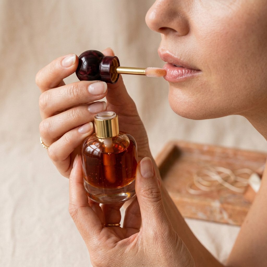
Not every lip look needs the precision or visual weight of an opaque lipstick. Apricot Lacquer explores a different mood: warm apricot colour, a reflective surface, and a rounded bottle that feels closer to a miniature dressing-table object than an everyday tube. The creative direction is translucent and sunlit rather than pale or sugary. Deep garnet at the cap keeps the palette grounded, while a gold-toned neck adds a narrow line of brightness. Together, these details make the design feel grown-up, expressive, and a little unexpected before the applicator even reaches the lips.

The colour study: apricot with depth
Apricot sits between peach, amber, and a softened terracotta in this visual story. That middle ground is the point: it offers warmth without relying on a vivid coral statement. In the bottle, the colour appears concentrated because it is seen through a deeper volume of liquid; in the lip imagery, the intended direction is lighter and more translucent. Treat those photographs as an artistic guide, not a guarantee of identical payoff on every natural lip colour. Light, application amount, and the underlying tone of the lips all change how a warm shade is perceived.
Three ways to build the mood
For an understated daytime look, imagine the lip as the only reflective element, with softly groomed brows and a restrained cheek. For a warmer monochromatic composition, bring muted peach or cinnamon tones into the rest of the makeup without copying the lip colour exactly. For evening, contrast the apricot direction with a deeper brown eye or an ink-coloured outfit. The aim is not to make one product perform every possible role. It is to show how a single colour idea can sit within distinct styling choices, from quiet and fresh to richer and more deliberately dressed.

Why the bottle is rounded
The short, curved bottle gives the design a compact visual centre of gravity. A dark spherical cap repeats that softness at a smaller scale, while the straight neck interrupts the curves just enough to keep the silhouette composed. This balance matters: too many decorative elements would make the object feel busy, while a standard cylinder would lose the collectible quality. The transparent body allows the apricot tone to remain part of the packaging story. In close-up, the contrast between the dark cap and warm contents becomes the main decoration, with no logo needed to fill the empty space.
A closer look at the shine
The texture imagery concentrates on reflected light, the colour held on the applicator, and the warmer depth visible through the bottle. The desired visual finish is luminous rather than metallic. There is no glitter-led colour story here; the interest comes from clear highlights moving across a warmer base. We have not translated that visual direction into unsupported promises about hydration, plumping, stickiness, or wear time. Those qualities depend on the finished formulation and testing. What this preview can show clearly is the intended aesthetic: glossy lips that belong in the look rather than overpowering it.
Small decisions make the look personal
Try pairing the apricot palette with a cream shirt and warm-metal jewellery for a soft, cohesive composition. Alternatively, set it against charcoal, slate blue, or a crisp white collar so the warmth feels more deliberate. A slightly blurred eye shape keeps the overall result relaxed; a precise liner makes the same lip direction feel more polished. Think in relationships rather than rigid rules. You do not need identical undertones in every product, and you do not need a heavy eye to justify a reflective lip. Leaving something quiet often makes the colour choice more noticeable.

From tabletop to close-up
The two lifestyle scenes move from tactile fabric to a more architectural dressing-room setting. The detail images then bring attention back to the bottle neck, the round cap, and the applicator. Finally, the person-use image places the colour in a human context, where the shape of the mouth and natural light matter more than the still-life arrangement. This sequence is intentional: first the object, then the texture, then the expression. The gift-box scene is a separate presentation idea and should not be read as confirmation that the illustrated box or styling accessories are included.
A warm accent, thoughtfully edited
Apricot Lacquer belongs to a beauty wardrobe that values nuance: a lip that catches light, a shade that warms the face, an object that looks considered without announcing itself. The concept is not about making every look brighter. It is about choosing one warm point of focus and letting the rest breathe. This is a design preview, with final colour payoff, ingredient list, fill volume, formula characteristics, supplied accessories, and usage directions awaiting confirmation from the actual product. The photographs communicate the proposed aesthetic and do not establish verified skincare benefits or performance claims.