Aurora Ink — Midnight Teal Precision Liquid Eye Colour with Fine Shimmer
Aurora Ink — Midnight Teal Precision Liquid Eye Colour with Fine Shimmer
Couldn't load pickup availability

Aurora Ink — Midnight Teal Precision Liquid Eye Colour with Fine Shimmer
Leave the expected line behind. 🌌
Black has its place. Aurora Ink explores another possibility: midnight teal with a fine, light-catching visual texture. From a distance, the colour story is dark and restrained. In the close-up, blue-green detail becomes the reason to look again.
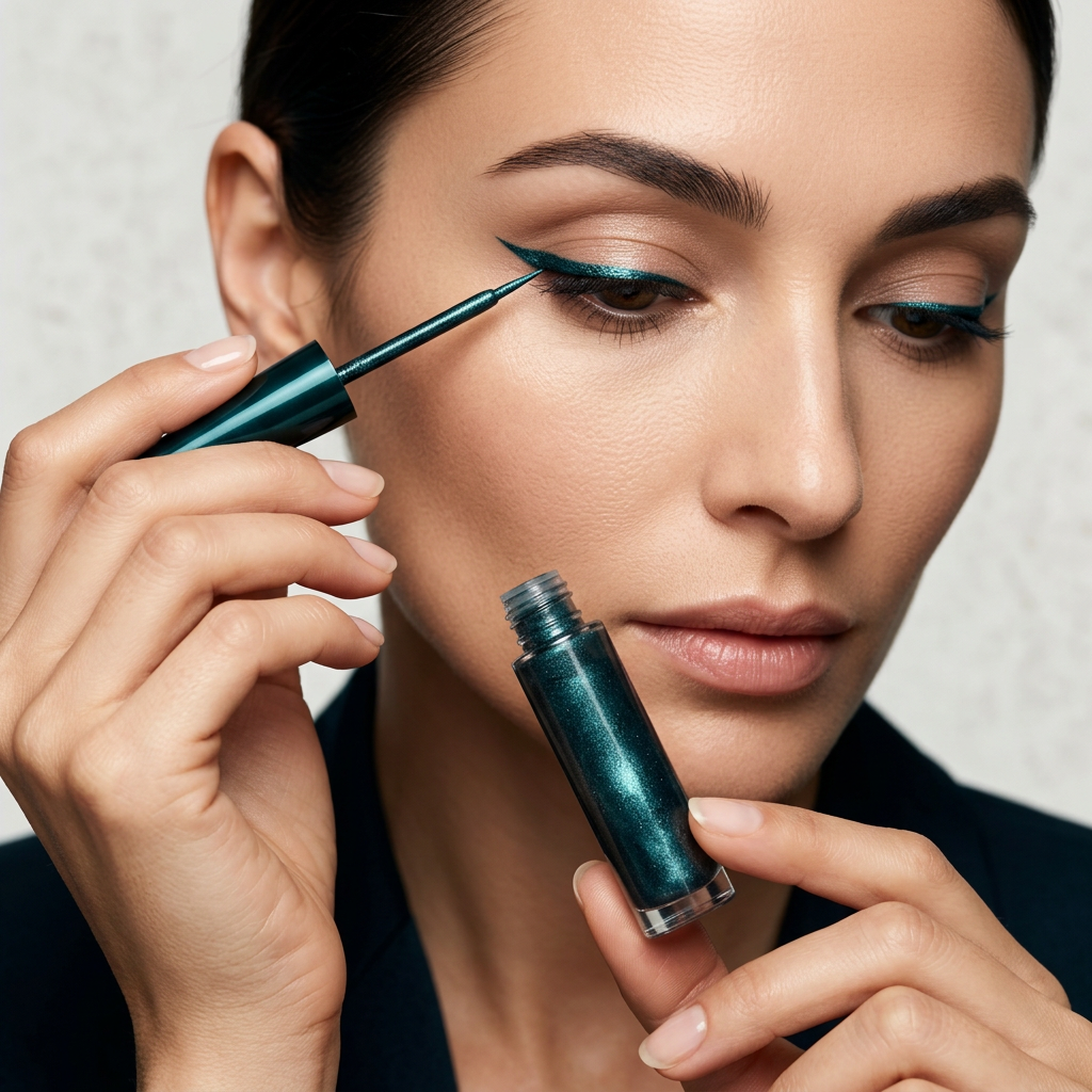
The concept pairs a slender smoky-teal bottle with an elongated forest-green cap and a fine applicator. The proportions are intentionally graphic: a compact cylinder beside a long tapered shape, colour held in a clear-sided vessel and precision suggested by the narrow tip.

One shade, three creative expressions
The quiet accent
Keep the overall eye look simple and imagine a small teal accent at the outer lash line. The contrast against neutral eye makeup gives the colour room to register. It is a direction for people who want to explore colour without building an elaborate multishade look.
The elongated evening line
Use the midnight-teal colour story as the focal point of a more graphic outer-eye shape. Pair the idea with a muted lip and minimal cheek colour so the eye remains the clearest statement. Silver-toned accessories and a dark neckline reinforce the cool palette.
The editorial detail
For a more expressive interpretation, consider a small detached accent beside the outer eye rather than a full dramatic sweep. Negative space becomes part of the design. The inspiration is controlled, deliberate mark-making, not more colour for its own sake.
Why this bottle looks different
Smoky transparency lets the teal colour remain visible. The deep-green cap adds contrast without introducing a separate metallic colour, while the narrow applicator creates a precise visual rhythm beside the bottle. There is no logo-led decoration. The identity comes from the relationship between the vessel, the long cap and the midnight shade.

The supporting palette
Ice blue, silver and forest green give Aurora Ink its photographic world. Cool stone and softly reflected light make the small bottle feel purposeful rather than lost among props. The detail photographs move closer, concentrating on the shimmer, the bottle opening and the fine tip.
Choose this direction when you want your eye makeup to feel individual, polished and a step outside the usual neutral routine.
Midnight teal, considered up close
The colour sits where blue and green meet, with enough darkness to keep the overall mood restrained. It is not the vivid turquoise of a bright summer palette, nor the nearly black simplicity of a conventional liner. The visual interest lies in the space between them: a deep colour that becomes more expressive when light catches the fine reflective detail.
In the bottle, small points of light interrupt the dark teal field. Beside the forest-green cap, the colour feels cooler. Against the pale photographic background, the same bottle becomes a strong vertical line. These small contrasts explain the appeal of the object without adding decorative print or a second bright colour.
A styling decision tree
If your wardrobe is mostly neutral: use the teal direction as the one deliberate colour accent. Charcoal, black, cool grey and cream provide a quiet setting. Keep the lip soft and the accessories simple so the eye detail does not have to compete.
If you like warm makeup: think about contrast rather than exact matching. A warm bronze eye palette and a cooler teal accent can feel intentional when the remaining colours are restrained. The warmth and coolness need room to remain distinct.
If you prefer an editorial look: focus on the shape of the mark as much as its colour. A narrow outer-eye accent and a larger graphic shape tell different stories. The first is discreet; the second becomes a main feature of the face. Neither needs several additional colours to feel complete.
Precision as a design language
The applicator is one of the most important details in the product image. Its narrow tip contrasts with the rounded bottle and elongated cap. Viewed together, the components create a sequence of shapes: cylinder, taper, fine line. That sequence gives the design a sense of purpose even before the model image introduces an eye look.
The clear-sided vessel also matters. It keeps the colour visible rather than hiding it inside an opaque case. With the cap placed beside the bottle, the proportions are easy to read. The object feels edited because every visible component belongs to the same cool, dark family.
From product portrait to makeup reference
The main photograph introduces the complete object. The close-up concentrates on the opening, the reflective colour and the fine applicator. The model image then translates the midnight-teal direction into a defined outer-eye look. Follow that sequence when choosing your own styling inspiration: first the colour, then the detail, then the role it plays in the whole face.
The portrait is not a promise of identical results on every eye shape or in every light. Its value is the composition: a clear teal focal point surrounded by quieter makeup. That balance is what gives the image its polished character.
Let one detail do more of the talking
There is a difference between an elaborate look and an intentional one. Aurora Ink belongs to the second idea. A single midnight-teal accent, a restrained palette and a well-chosen shape can make the whole look feel individual. Leave enough space around that decision for it to be noticed.

A distinctive colour story. A considered object. Your own interpretation.