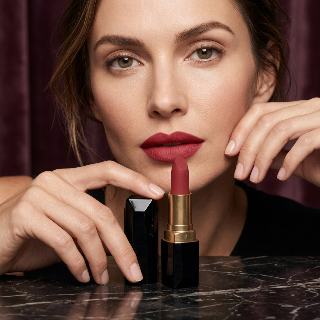
Obsidian Bloom — Sculpted Satin Lip Colour in Deep Rose Brick
Obsidian Bloom — Sculpted Satin Lip Colour in Deep Rose Brick
Couldn't load pickup availability

Obsidian Bloom — Sculpted Satin Lip Colour in Deep Rose Brick
Dark casing. Warm colour. A clear point of view. 💋
Obsidian Bloom is built around one deliberate contrast: a glossy, faceted black case opening to a deep rose-brick lipstick. An antique-gold-toned barrel brings warmth between the two. The result is a lipstick concept with the presence of a small accessory, not a disposable-looking detail at the bottom of a makeup bag.

The shade: rose with a grounded edge
The colour direction sits between muted rose and brick red. It is richer than a pale everyday pink and quieter than a vivid scarlet. In the visual story, it pairs naturally with espresso, cream, garnet and black, colours that let the lip become the central accent without demanding a completely different wardrobe.
The silhouette: a petal against stone
The bullet has a slanted, petal-inspired tip. Below it, the gold-toned barrel meets an angular black base; beside it, the matching cap repeats the faceted geometry. Softness belongs to the colour and the curved tip. Structure belongs to the casing. That relationship is what gives the design its character.
A statement does not have to be loud. Sometimes it simply needs the right shape and the right shade.

Two moods, one colour story
The understated interpretation: imagine a softly defined rose-brick lip with pared-back eye makeup, brushed brows and minimal jewellery. The evening interpretation: give the lip a more deliberate outline and pair it with a dark tailored neckline. These are styling directions for the same shade, not a need for two separate products.
Look closer before you close it
The black surfaces catch narrow bands of light, revealing the facets as the angle changes. The warm metallic barrel keeps the object from feeling severe. There is no prominent logo to interrupt the composition. Even with the cap beside it, the two pieces feel related through their edges and proportions.
For an edited makeup collection
Obsidian Bloom was conceived for someone who would rather choose one distinctive lip colour than collect several nearly identical ones. Its visual language is precise, a little dramatic and easy to recognise: rose brick, antique gold and glossy black, brought together in one sculpted object.
Not quite red. Not simply rose.
Deep rose brick is a useful description because each word contributes something different. Rose supplies the softer character. Brick introduces an earthy note that makes the colour feel more grounded. Deep describes its visual weight within the overall palette. It is a colour direction that can become the central accent of a look without depending on the brightness of a classic scarlet.
In the portrait, the lip sits beside clean eye makeup and a dark neckline. This gives it room to register. In the product view, the same colour is framed by black and antique gold, making the object feel more graphic. Neither setting is incidental: one explains how the shade can participate in a complete look, while the other reveals the contrast built into the design.
What makes the casing distinctive?
Look first at the cap. Its black surface is divided into irregular planes rather than a uniform round cylinder. A narrow reflection can reveal one edge while the adjacent plane remains dark. The base repeats that angular language, linking the two pieces even when they are separated. The warm barrel becomes the visual connection between the black frame and the rose-coloured bullet.
The petal-inspired tip introduces a softer line at the very top. That small change in geometry matters. Without it, the object would read as entirely architectural. With it, the design moves between structure and softness, which is also the relationship between its black exterior and rose-brick interior.
Choose your version of the statement
The daytime edit: imagine the colour alongside a white shirt, softly defined eyes and a simple hairstyle. Let the lip provide the main warm accent. Keep jewellery restrained so the overall impression remains clean rather than formal.
The tailored evening: combine the rose-brick direction with a black jacket or espresso neckline. A more deliberate lip shape and understated cheek colour create a focused composition. The effect comes from the relationship between the colours, not from adding more products.
The romantic contrast: place the same shade beside a muted berry eye and cream fabric. The lip becomes warmer by comparison, while the softer surrounding colours change the mood from graphic to romantic.
Questions of balance
Does everything need to match? No. Related colours can be more interesting than identical ones. A rose-brick lip can sit beside a softer rose cheek or a darker burgundy accessory without losing coherence.
Should the eye makeup be dramatic too? That is a styling choice. The campaign takes a more edited route, allowing the mouth to remain the focal point. If you prefer a stronger eye, use fewer competing colour accents elsewhere.
Will the colour look exactly like the portrait? The image is a creative reference. Lip colour, lighting and the rest of the makeup can change the final impression, so the portrait should not be read as a universal shade guarantee.
An object with a recognisable signature
Obsidian Bloom leaves the oversized lettering behind. Its signature is the contrast you remember: an angular black case, a warm metallic centre and a rose-brick petal at the top. Distinctive, but not overcomplicated.

A distinctive colour story. A considered object. Your own interpretation.