Prism Reverie — Sculptural Four-Shade Eye Colour Palette in Teal, Bronze, Berry & Champagne
Prism Reverie — Sculptural Four-Shade Eye Colour Palette in Teal, Bronze, Berry & Champagne
Couldn't load pickup availability

Prism Reverie — Sculptural Four-Shade Eye Colour Palette in Teal, Bronze, Berry & Champagne
Four colours. A different kind of evening. ✨
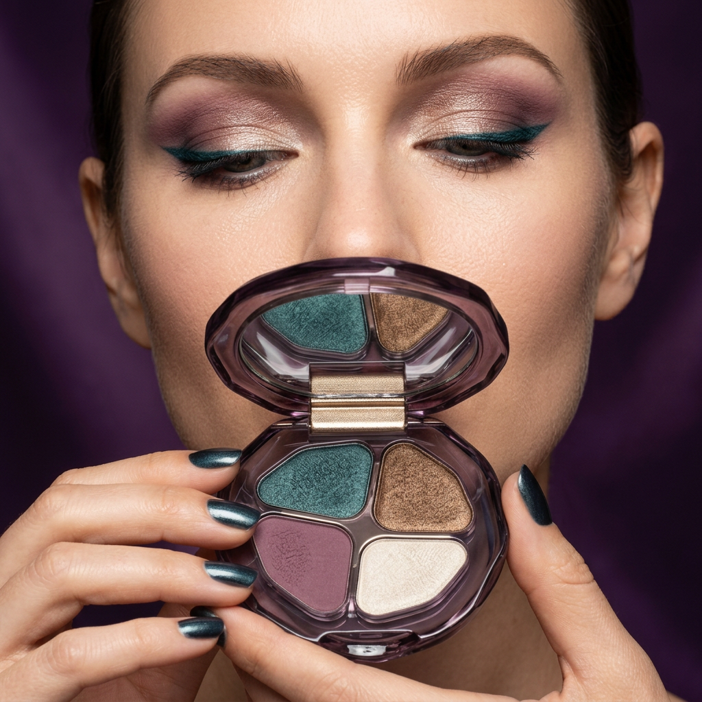
Some palettes offer endless choices. Prism Reverie takes a more deliberate approach: four expressive colours gathered into one sculptural compact. Peacock teal brings depth, bronze introduces warmth, smoky berry adds a romantic counterpoint, and pale champagne gives the composition its light. Together, they create a colour story that feels considered rather than crowded.

A small object with an architectural point of view
The smoky-purple compact has a rounded, irregular silhouette edged with facets. Inside, four mineral-inspired pans sit around a central meeting point, framed by champagne-toned detailing. The mirror repeats the compact’s organic outline. It is a design built around contrast: fluid curves outside, distinct colour territories within, dark translucent edges against luminous surfaces.
Meet the colour story
Peacock Teal: the focal shade, imagined along the outer lid or as a deliberate accent beside a quieter eye. Antique Bronze: a warm companion for neutral clothing and evening jewellery. Smoky Berry: a muted alternative to the usual brown, bringing softness to the overall palette. Pale Champagne: the lightest note, completing the contrast between shadow and illumination.

Three directions to explore
For a restrained daytime mood, build the look around champagne and bronze. For a softer evening composition, pair berry with a small touch of bronze. For the most expressive interpretation, let teal become the central colour and keep the rest of the face understated. These are creative colour pairings, not a requirement to use every shade at once.
The details worth a closer look
Open the compact to appreciate the irregular pan shapes, the subtle pressed surfaces and the way the mirror catches the palette from a second angle. Close it and the colour story becomes a dark, jewel-like object again. No oversized lettering competes with the silhouette. The visual identity comes from shape, proportion and colour.
Choose Prism Reverie when you want your makeup collection to feel edited, expressive and a little unexpected.
A closer reading of the four shades
Teal is the coolest, most unexpected note in the palette. Its blue-green character gives a different impression from navy or forest green: less traditional than the first, more mineral than the second. Beside bronze, it becomes a contrast of cool and warm. Beside berry, it feels darker and more expressive. You do not need to turn the whole eyelid teal to make that relationship visible; a small area of colour can establish the mood.
Bronze provides the bridge between the statement shade and the lighter champagne. In the product portrait, its surface catches light with a warm metallic character, while berry appears quieter and more muted. That difference matters to the overall composition. When every element competes for attention, the eye has nowhere to rest. Here, the berry colour gives the brighter notes a calmer companion.
Champagne completes the arrangement with a pale, creamy tone. It is not simply an extra neutral added to fill a pan. Visually, it creates the greatest contrast against the compact’s dark frame and the teal shade. Think of it as the lightest point in a small painting, a way to introduce breathing room into a richer colour story.
Build the mood before you choose the placement
Warm and understated: start with a styling idea centred on bronze and champagne. Add an ivory shirt, a soft rose lip and a small gold-toned accessory. The palette then becomes part of a warm, tonal look rather than a separate colourful statement.
Romantic after dark: let berry set the emotional tone and introduce bronze as the warmer accent. Burgundy clothing or a dark brown neckline can echo the palette without matching it exactly. Keep the lip within a muted rose family so the colours feel related rather than identical.
Cool and graphic: make teal the deliberate point of interest. A charcoal jacket, simple hair and restrained cheek colour leave room for the eye detail. The contrast is the important part: one clear colour decision surrounded by quieter elements.
What the photographs invite you to notice
The main view shows the complete arrangement, including the mirror and the relationship between the four pans. The closer images reveal the irregular edges, the pressed surfaces and the pale metallic borders. In the portrait, the same colour family becomes a complete styling reference. Treat the portrait as inspiration for the balance of colours, rather than a promise that every complexion or lighting condition will produce the same result.
Small palette, deliberate choices
Prism Reverie is not about collecting more versions of the same brown. It is about choosing a compact whose colours have distinct roles. A cool focal point, a warm metallic companion, a softened berry and a pale contrasting note create an edited vocabulary. The pleasure is in finding the combination that feels like you, whether that means the quietest pairing or the most expressive contrast.

A distinctive colour story. A considered object. Your own interpretation.