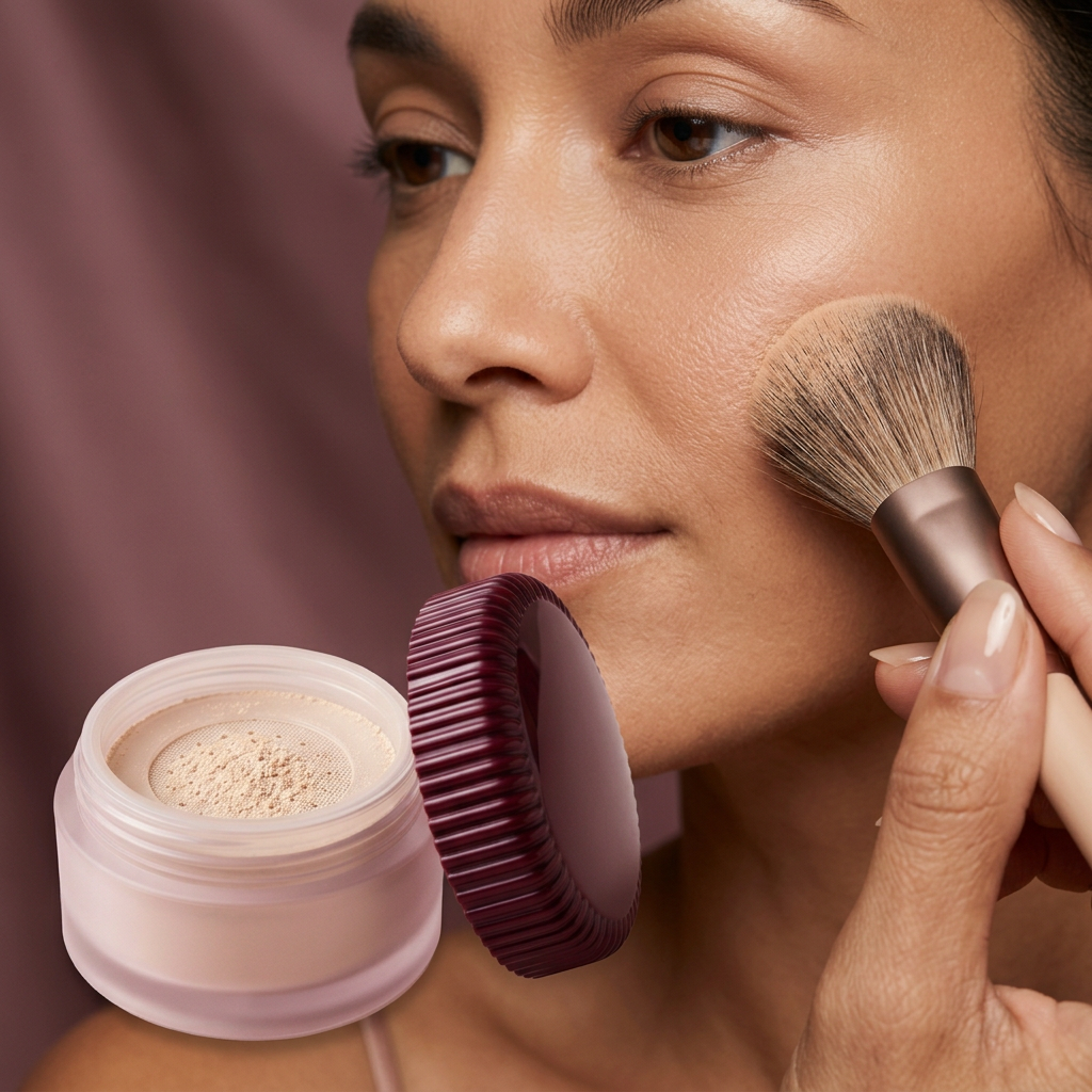
Velvet Eclipse — Loose Finishing Powder in a Frosted Rose Jar with Fluted Burgundy Lid
Velvet Eclipse — Loose Finishing Powder in a Frosted Rose Jar with Fluted Burgundy Lid
Couldn't load pickup availability

Velvet Eclipse — Loose Finishing Powder in a Frosted Rose Jar with Fluted Burgundy Lid
🪞 The finishing room
What if the quietest step in a makeup routine had one of the most memorable objects? Velvet Eclipse pairs a pale, frosted rose jar with a deep burgundy lid, using contrast rather than decoration to make a loose-powder concept feel distinctive. It belongs to the moment when the rest of the look is already taking shape and attention turns to the smaller decisions. Where should the face catch light? Which textures should remain visible? How much detail is enough? This is the creative territory of the design: thoughtful finishing, not an invitation to cover every surface with more product.

Question one · Why rose and burgundy?
The jar and lid are related in colour but very different in depth. Pale rose keeps the body visually light, while burgundy gives the top a definite outline. A frosted appearance softens the colour below; narrow fluting along the lid creates a more precise rhythm above. The relationship is richer than a simple pastel package because there is a darker anchor in the composition. In the product photography, this lets the object sit comfortably against both pale stone and more saturated fabric. The visual finish is the design reference, not a certification of a particular glass, resin, or manufacturing process.
Question two · What does the close-up reveal?
The detail views focus on the circular sifter, the pale beige powder, the edge of the jar, and the ridged perimeter of the lid. Each element contributes something different: the circle gives order, the powder adds a tactile contrast, and the fluting brings movement to the outline. The intention is to make an everyday format feel considered rather than simply place it inside a decorative box. The pale beige shown is a concept shade, not a confirmed universal match or a guarantee that the finished powder will be invisible on every skin tone. Shade selection requires real product information.

Question three · How does restraint change a look?
Imagine a makeup composition with a softly defined eye, a restrained cheek, and one luminous detail on the lips. The finishing step can be considered in relation to that whole picture rather than as a separate task. A completely uniform surface is not the only aesthetic worth pursuing. Deliberate variation can make a look feel more personal, with quieter areas supporting the points of emphasis. These are styling ideas, not tested claims that this proposed powder will blur, mattify, control oil, resist humidity, or prevent creasing. Those outcomes depend on the actual formula and how it is used.
The texture conversation
A beauty look becomes more interesting when its textures are chosen with the same attention as its colours. Pair a reflective lip direction with a more understated base, or place a softly luminous eye next to an otherwise quiet composition. The jar's own surfaces echo this principle: diffuse body, glossy-looking lid, loose powder, and a precise circular opening. Nothing needs to shout, because the contrast creates the interest. In the editorial imagery, the nearby fabrics and light sources make those differences easier to notice. They are there to frame the design, not to stand in for evidence of a measured finish on skin.
At the mirror
The person-use scene places the loose-powder idea in the context of a face and a makeup brush. It suggests a light, considered finishing gesture rather than a heavy application routine. A brush visible in that image is a styling tool, not a confirmed included accessory. The final directions should determine the appropriate method, amount, and placement for the real product. We have not added a baking routine, a fixed waiting time, or a universal instruction for every skin type. Those details would imply knowledge of a formulation that has not yet been supplied. The preview stays focused on the intended look and object.

A place on the dressing table
Velvet Eclipse is imagined beside a cream ceramic dish, a darker textile, or a small arrangement of well-chosen daily objects. The low, circular profile gives it a different rhythm from the taller bottles in the collection, while burgundy connects it to a richer colour wardrobe without repeating an existing product's packaging. In the gift scene, a calm lining frames the jar and gives the fluted lid space to be seen. That box is a presentation proposal only. It is not a promise of retail packaging, and the scene does not establish that brushes, puffs, fabric, or other props are supplied.
The answer is in the balance
This design is for people who enjoy the details of getting ready, including the quieter ones. Velvet Eclipse does not need an elaborate silhouette to have a point of view: rose and burgundy, soft and defined, circular and fluted are enough. Its personality comes from knowing where to stop. This is a design-preview page. Final ingredients, net weight, available shades, suitability, performance, application instructions, packaging materials, and included contents must be confirmed against the real item before sale. The images communicate a proposed direction and should not be treated as proof of pore-blurring, long wear, skincare benefits, or a universal finish.